集合视图
键盘中除了单独的按键外,还可以使用集合显示一组数据。比如常见的「符号列表」。
集合视图使用 type 关键字来指定,常见的集合视图类型有:
symbols:纵向符号列表,纵向显示一列数据。classifiedSymbols:一级分类符号列表,纵向显示一列数据,点击后当前界面中的二级分类符号会显示其子类符号。subClassifiedSymbols:二级分类符号列表,纵向显示数据。作为classifiedSymbols的子类符号显示。horizontalSymbols:横向符号列表,横向显示一列数据。horizontalCandidates:横向显示一列候选字。仅在horizontalCandidatesLayout横向候选字栏布局中有效。verticalCandidates:纵向显示候选字。numericSymbols: 数字键盘符号列表,即内置数字键盘中左侧纵向显示的列表。可以在「键盘设置」-「数字键盘符号设定」中配置数据源。(v1.5.0 版本及以上支持)categorySymbols: 分类符号列表,布局类似内置的符号键盘的样子,上下结构,上部显示具体的符号信息,下部显示符号的分类。数据源是内置的,不支持修改。(v1.5.0 版本及以上支持)t9Symbols: 中文九键(T9)键盘符号列表,即 T9 键盘中左侧纵向显示的列表。可以在「键盘设置」-「中文九键符号设定」中配置数据源。(v1.16.0 版本及以上支持)
配置示例:
categoryCollection: type: classifiedSymbols集合视图的分类
Section titled “集合视图的分类”纵向符号列表
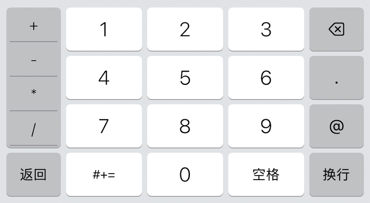
Section titled “纵向符号列表”纵向符号列表用于纵向显示一组数据,如数字键盘中左侧的符号列表:
配置示例:
numericCollection: # 集合视图类型 type: symbols # 声明集合视图的尺寸,与按键尺寸定义相同 size: height: 3/4 # 定义集合视图的内边距 insets: { top: 6, bottom: 6 } # 定义集合视图的背景样式 backgroundStyle: systemButtonBackgroundStyle # 定义集合视图中每个单元格的文本样式 cellStyle: collectionCellStyle # 定义集合视图的数据源 dataSource: symbols
symbols: - "+" - "*" - "-" - "/" - "()" - "." - "@" - "," - "#" - ":" - "_" - "=" - "?" - "¥"
collectionCellStyle: insets: { left: 4, right: 4 } backgroundStyle: collectionCellBackgroundStyle foregroundStyle: collectionCellForegroundStyle
collectionCellBackgroundStyle: buttonStyleType: fileImage highlightImage: file: anjian image: image1
collectionCellForegroundStyle: buttonStyleType: text normalColor: 575757 highlightColor: 000000 fontSize: 18 fontWeight: boldtype:必选,表示集合视图的类型。符号列表使用symbolssize:必选,表示集合视图的尺寸。与键盘按键尺寸的定义相同insets:可选,表示集合视图的内边距。注意:当滚动时,如果出现内容超过背景时,请调整内边距的值来修复此问题backgroundStyle:可选,表示集合视图的背景样式。与按键背景样式自定义相同cellStyle:必选,表示集合视图中单元格的样式。与按键样式自定义相同
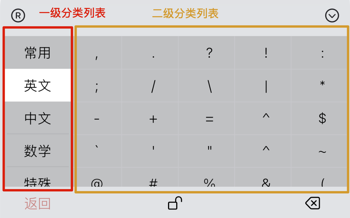
分类符号列表
Section titled “分类符号列表”分类符号列表有一级分类和二级分类两种类型:
classifiedSymbols:一级分类符号列表用于显示一组一级分类符号,点击后会在当前界面中显示其子类符号subClassifiedSymbols:二级分类符号列表用于显示一组二级分类符号,作为一级分类符号的子类符号显示
注意:两者应该同时使用。
一级分类列表配置示例:
categoryCollection: # 注意 type 的值 type: classifiedSymbols size: width: 60/375 insets: { left: 4, right: 4, top: 4, bottom: 4 } backgroundStyle: systemButtonBackgroundStyle dataSource: category cellStyle: collectionCellStyle
collectionCellStyle: backgroundStyle: collectionCellBackgroundStyle foregroundStyle: collectionCellForegroundStyle
collectionCellBackgroundStyle: buttonStyleType: fileImage highlightImage: file: anjian image: image11
collectionCellForegroundStyle: buttonStyleType: text normalColor: 000000 badgeNormalColor: 575757 badgeHighlightColor: 575757 fontSize: 18 fontWeight: bold
category: [ "常用", "中文", "英文", ... ]常用: - "," ...中文: - "《》" ...英文: - "," ......一级分类列表配置与符号列表配置类似,只是 type 的值不同。
二级分类列表配置示例:
descriptionCollection: type: subClassifiedSymbols size: width: 315/375 insets: { left: 4, right: 4, top: 4, bottom: 4 } backgroundStyle: systemButtonBackgroundStyle cellStyle: collectionCellStyle displaySeparatorLine: false separatorLineColor: "#BAB2B9" maximumRow: 7 maximumColumn: 7
collectionCellStyle: backgroundStyle: categoryCollectionCellBackgroundStyle foregroundStyle: descriptionCollectionCellForegroundStyle
descriptionCollectionCellForegroundStyle: buttonStyleType: text fontSize: 8 highlightColor: "#4D6357" normalColor: "#271D25" badgeNormalColor: 575757 badgeHighlightColor: 575757 badgeFontSize: 8二级分类列表与一级分类列表和符号列表配置类似,只是 type 的值不同,且没有 dataSource 属性。
因为二级分类列表的数据是由一级分类列表决定的,所以不需要 dataSource 属性。
二级分类有自己一些额外的参数:
displaySeparatorLine:可选,表示是否显示单元格之间的分割线,默认值为trueseparatorLineColor:可选,表示分割线的颜色,默认值为 iOS 默认分割线颜色maximumRow:可选,表示二级分类列表的最大行数,默认值为 4maximumColumn:可选,表示二级分类列表的最大列数,默认值为 5
同时二级分类的 cellStyle 样式也可以对半角全角符号角标字体大小进行自定义:
badgeFontSize:可选,表示全角符号角标的字体大小,默认为系统最小字体大小。 注意位置在示例中的descriptionCollectionCellForegroundStyle样式中。badgeNormalColor:可选,表示全角符号角标的正常颜色,默认为系统默认字体颜色badgeHighlightColor:可选,表示全角符号角标的高亮颜色,默认为系统默认字体颜色
横向符号列表
Section titled “横向符号列表”横向符号列表用于横向显示一组数据,如可滑动的工具栏区域。
配置示例:
horizontalNumberSymbols: type: horizontalSymbols size: width: 2/3 maxColumns: 10 contentRightToLeft: true insets: { left: 3, right: 3 } backgroundStyle: alphabeticBackgroundStyle dataSource: horizontalSymbolsDataSource cellStyle: collectionCellStyle
collectionCellStyle: backgroundStyle: collectionCellBackgroundStyle foregroundStyle: collectionCellForegroundStyle
collectionCellBackgroundStyle: buttonStyleType: fileImage highlightImage: file: anjian image: image11
collectionCellForegroundStyle: buttonStyleType: text normalColor: 000000 badgeNormalColor: 575757 badgeHighlightColor: 575757 fontSize: 18 fontWeight: bold
horizontalSymbolsDataSource: - 1 - 2 - 3 - 4 - 5 - 6 - 7 - 8 - 9 - 0type:必选,表示集合视图的类型。横向符号列表使用horizontalSymbolssize:必选,表示集合视图的尺寸。与键盘按键尺寸的定义相同maxColumns:可选,表示集合视图的最大列数,默认值为 5注意:只有当数据源中数据超过此数值后,列表才能滑动,少于或等于此数值时,视图无法滑动
contentRightToLeft:可选,表示集合视图内容是否从右向左显示,默认为falseinsets:可选,表示集合视图的内边距注意:当滚动时,如果出现内容超过背景时,请调整内边距的值来修复此问题
backgroundStyle:可选,表示集合视图的背景样式。与按键背景样式自定义相同cellStyle:必选,表示集合视图中单元格的样式。与按键样式自定义相同注意:
cellStyle中的foregroundStyle样式只能配置字符串样式引用,且只能使用text类型dataSource:必选,表示集合视图的数据源。数据源是一个数组,数组中的每一项表示集合视图中的一个单元格
横向候选字列表
Section titled “横向候选字列表”横向候选字列表用于横向显示一组候选字。
配置示例:
horizontalCandidates: type: horizontalCandidates size: width: 2/3 insets: { left: 3, right: 3 } backgroundStyle: systemButtonBackgroundStyle candidateStyle: candidateStyle
candidateStyle: insets: { left: 3, right: 3 } highlightBackgroundColor: ffffff preferredBackgroundColor: ffffff preferredIndexColor: 000000 preferredTextColor: 000000 preferredCommentColor: 000000 indexColor: 000000 textColor: 000000 commentColor: 000000 indexFontSize: 18 textFontSize: 18 commentFontSize: 18type:必选,表示集合视图的类型。横向候选字列表使用horizontalCandidatessize:可选,表示集合视图的尺寸。与键盘按键尺寸的定义相同insets:可选,表示集合视图的内边距注意:当滚动时,如果出现内容超过背景时,请调整内边距的值来修复此问题
backgroundStyle:可选,表示集合视图的背景样式。与按键背景样式自定义相同candidateStyle:必选,表示单个候选字的样式
在 candidateStyle 引用的样式中,不必使用 buttonStyleType 属性。
insets:可选,表示候选字的内边距。可以通过此值缩小背景色的范围highlightBackgroundColor:可选,表示候选字被选中时的背景色preferredBackgroundColor:可选,表示首选候选字的背景色preferredIndexColor:可选,表示首选候选字的索引颜色preferredTextColor:可选,表示首选候选字的文本颜色preferredCommentColor:可选,表示首选候选字的 comment 信息颜色indexColor:可选,表示非首选候选字的索引颜色textColor:可选,表示非首选候选字的文本颜色commentColor:可选,表示非首选候选字的 comment 信息颜色indexFontSize:可选,表示候选字索引的字体大小textFontSize:可选,表示候选字文本的字体大小commentFontSize:可选,表示候选字 comment 信息的字体大小
纵向候选字列表
Section titled “纵向候选字列表”纵向候选字列表用于纵向显示一组候选字。
配置示例:
verticalCandidates: type: verticalCandidates maxRows: 4 separatorColor: "#33338888" backgroundStyle: alphabeticBackgroundStyle candidateStyle: verticalCandidateCellStyle
verticalCandidateCellStyle: highlightBackgroundColor: ffffff preferredBackgroundColor: ffffff preferredIndexColor: 1a73e9 preferredTextColor: 1a73e9 preferredCommentColor: 1a73e9 indexColor: 000000 textColor: 000000 commentColor: 000000 indexFontSize: 16 textFontSize: 16 commentFontSize: 16 bottomRowHeight: 50type:必选,表示集合视图的类型。纵向候选字列表使用verticalCandidatesmaxRows:可选,表示集合视图的最大行数,默认值为 5separatorColor:可选,表示候选字之间的分割线颜色backgroundStyle:可选,表示集合视图的背景样式。与按键背景样式自定义相同candidateStyle:必选,表示单个候选字的样式candidateStyle样式的定义与横向候选字列表的candidateStyle样式定义相同。
集合视图的数据源是一个数组,数组中的每一项表示集合视图中的一个单元格。
数组中的元素类型支持以下几种方式定义:
- 直接使用字符串或数字表示单元格内容
horizontalSymbolsDataSource: - 1 - "a" ...此时显示内容也为输出内容,且会直接输出,不会发送给 RIME 引擎。
- 显示与输出分开定义
horizontalSymbolsDataSource: - { label: '1', value: "a" } - { label: '2', value: "b" } ...此时 label 表示显示内容,value 表示直接输出内容,输出内容不会发送给 RIME 引擎。
- 使用 action 定义单元格行为
horizontalSymbolsDataSource: - { label: '1', action: tab } ...此时 label 表示显示内容,action 表示点击单元格的行为。行为配置与按键的 action 配置相同。
数据源显示样式
Section titled “数据源显示样式”默认情况下,数据源的显示都是以字符串形式显示的。由集合视图的 cellStyle 样式中的 foregroundStyle 样式决定。
如果需要自定义显示样式,可以在数据源中使用 styleName 属性,定义每个单元格的显示样式。
horizontalSymbolsDataSource: - { label: "1", action: tab, styleName: "leftArrowButton" }leftArrowButton: backgroundStyle: alphabeticBackgroundStyle foregroundStyle: - leftArrowButtonForegroundStyle引用样式的定义与按键样式定义相同。